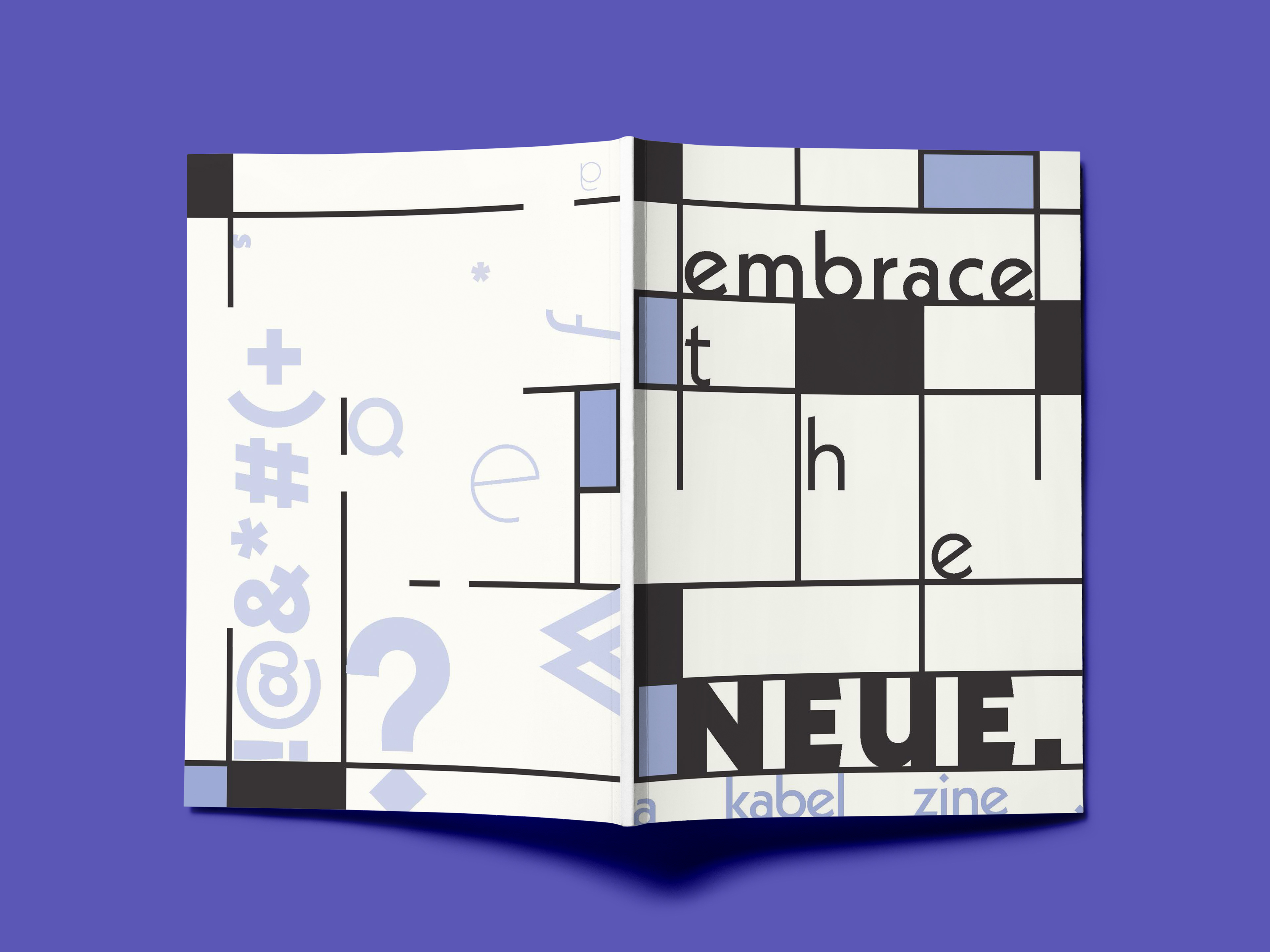
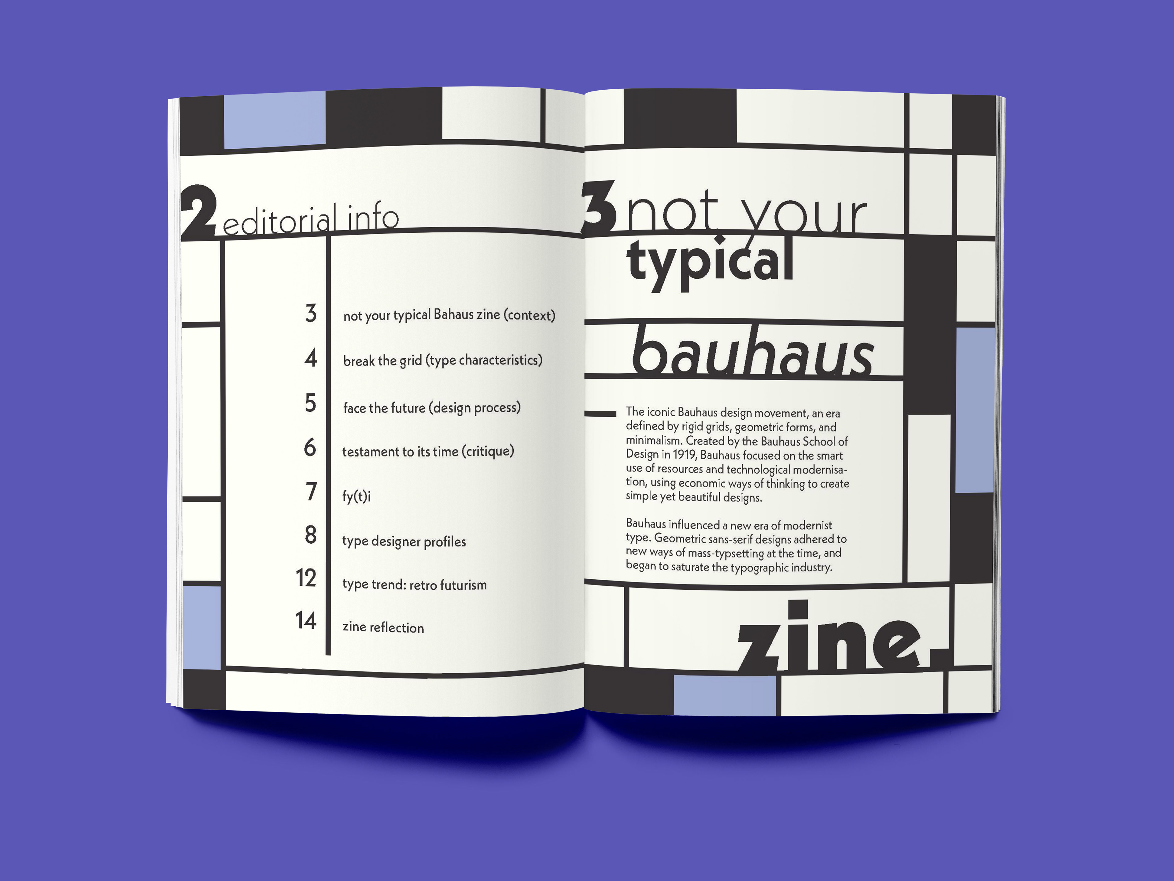
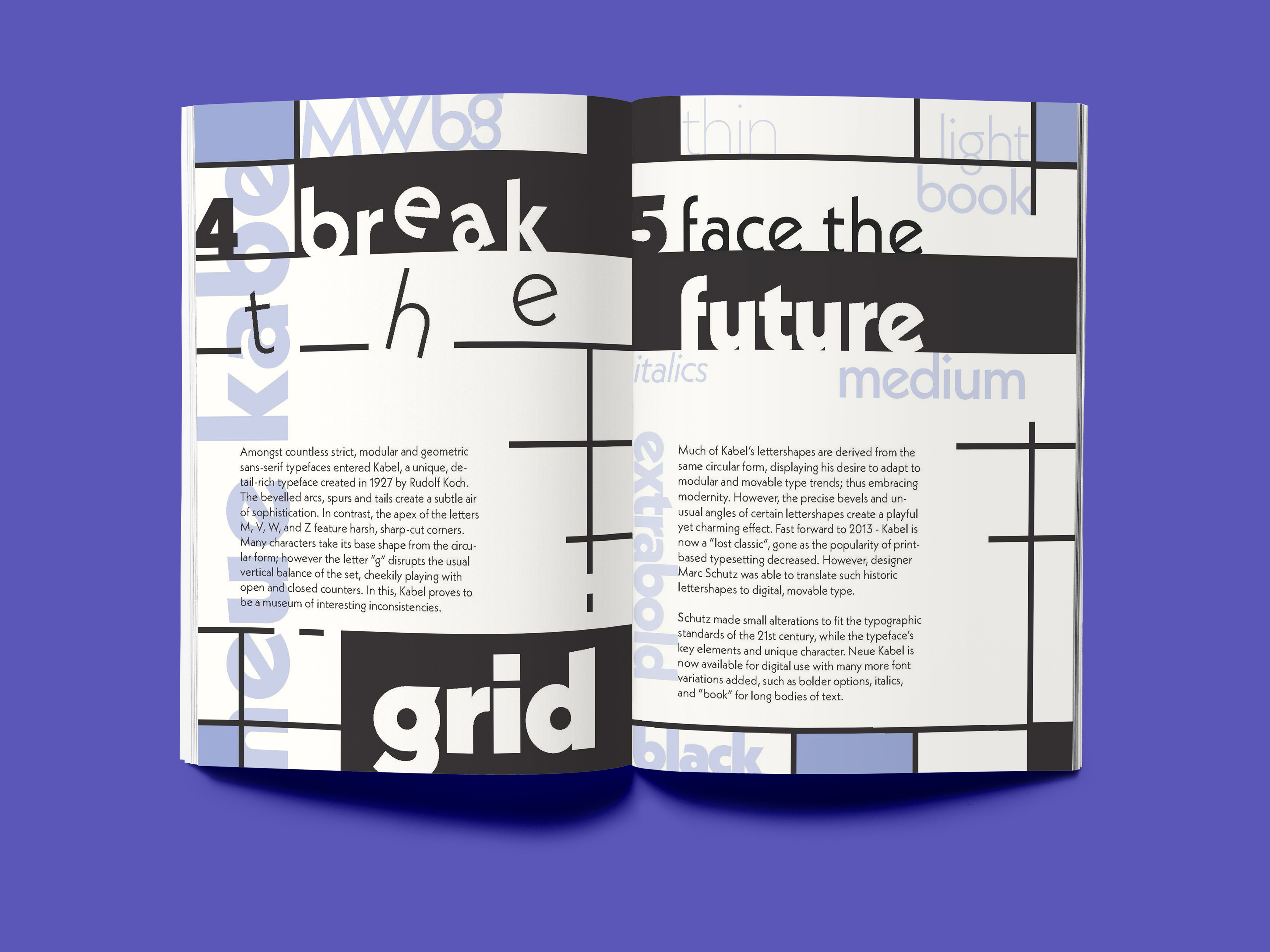
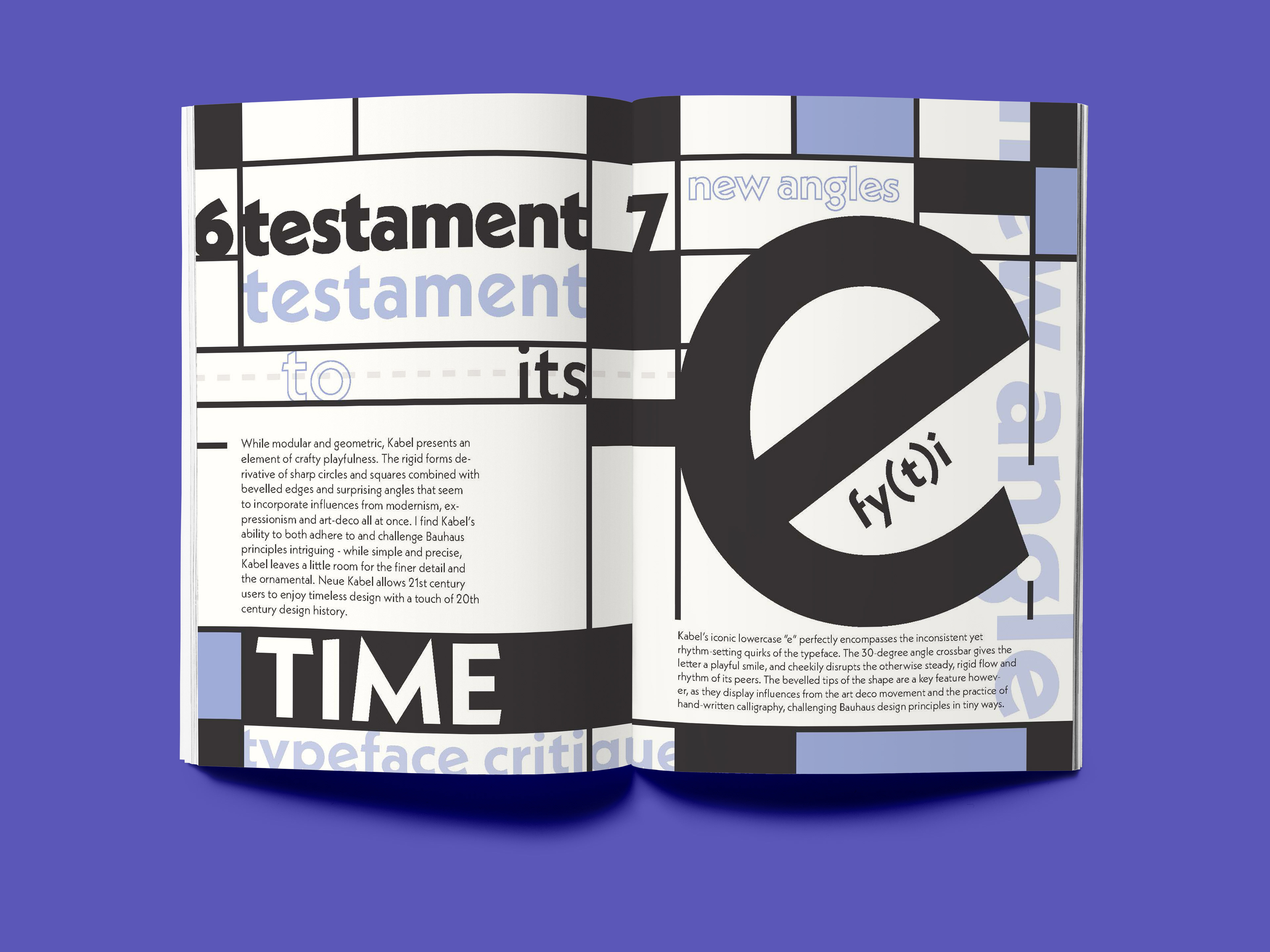

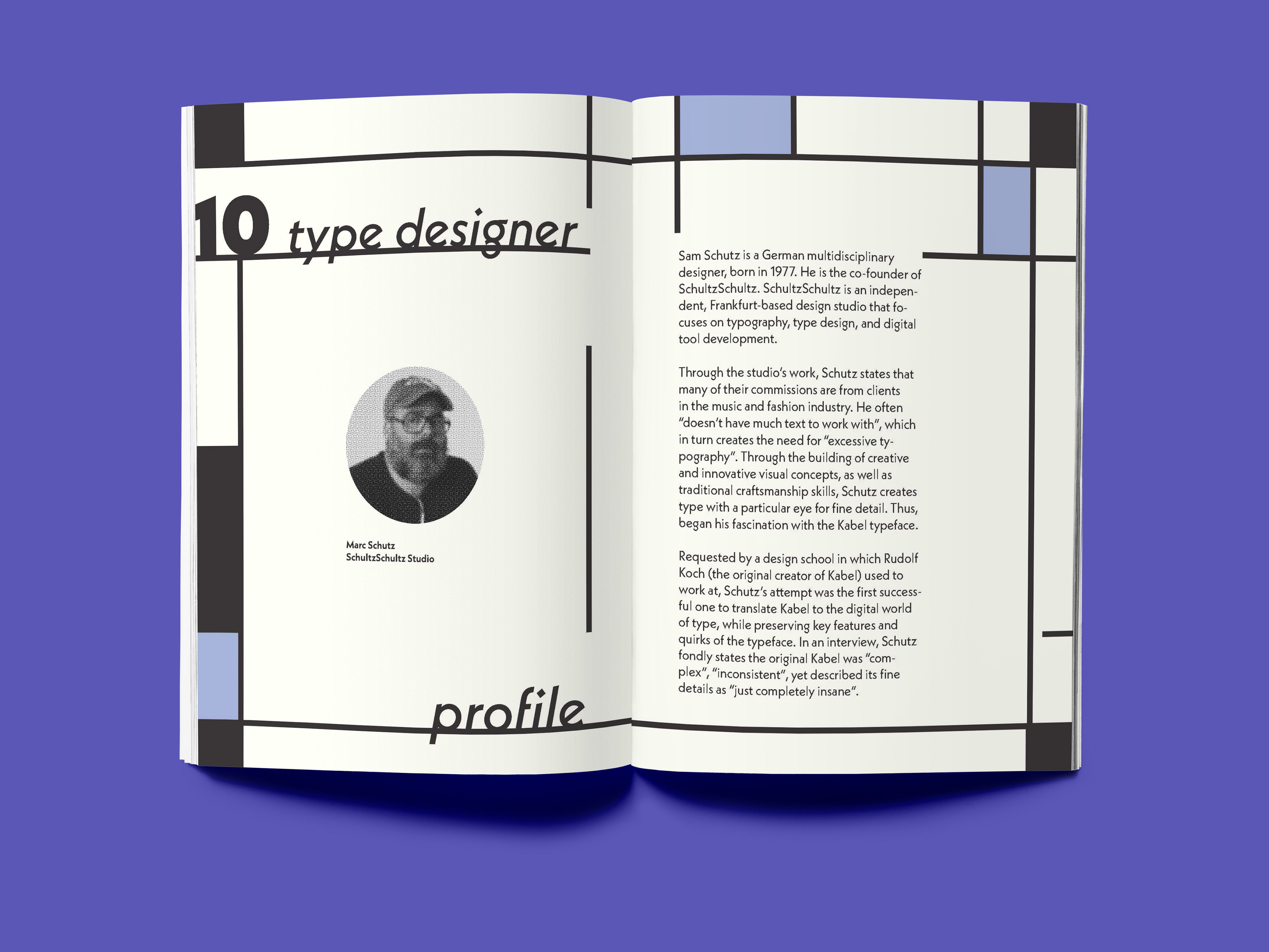
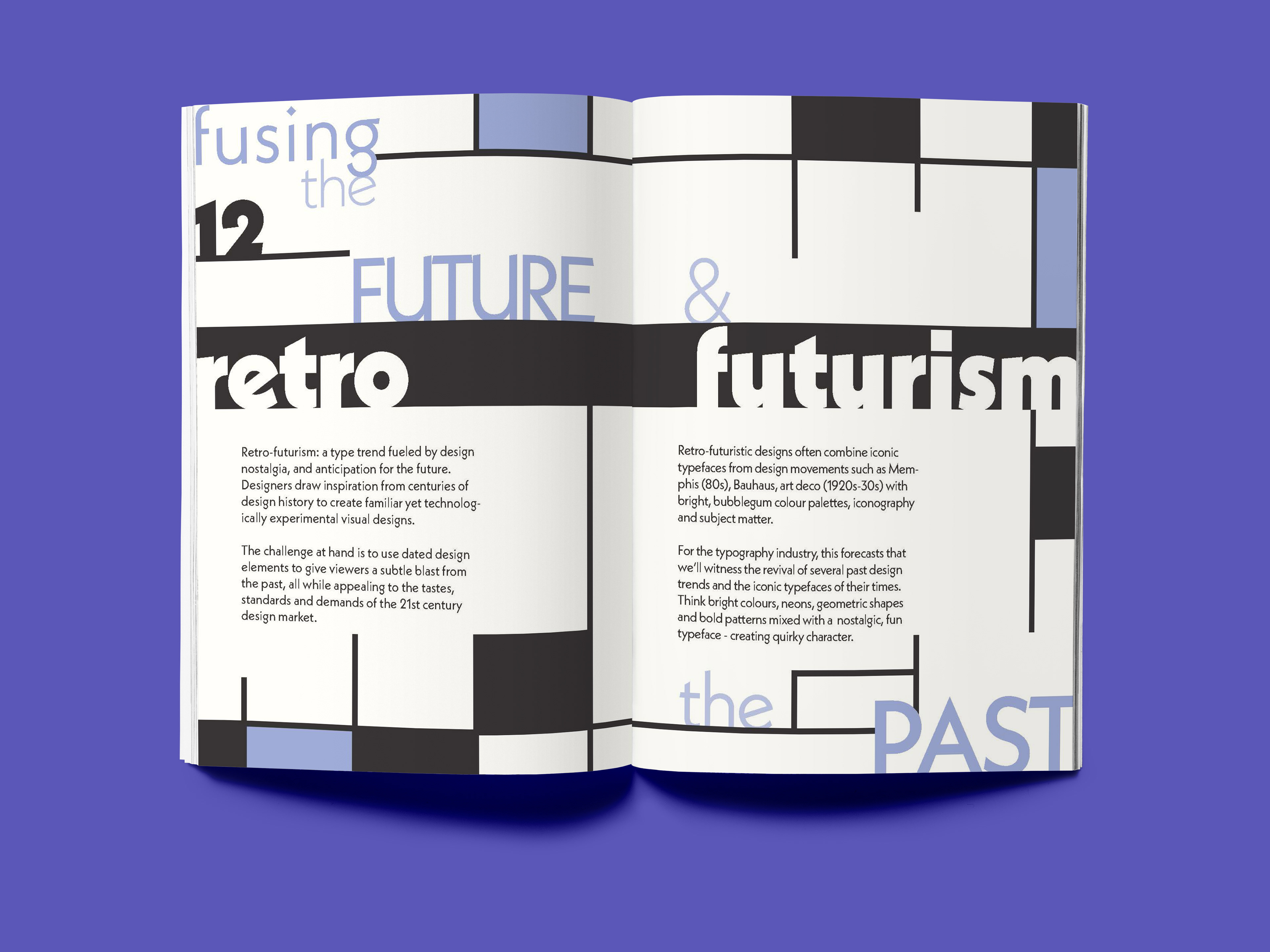

The task was to create a typographic zine and editorial composition showcasing a typeface of our choice, discussing the design context, formal elements and designers relating to the typeface.
The final zine titled “Embrace the Neue” explores the Neue Kabel/Kabel typeface(s) as a staple design of the Bauhaus movement by taking playful inspiration from Charlotte Perriand's iconic Modernist furniture.
I critique the typeface’s integration of Bauhaus, Art Deco and calligraphic influences to showcase its unique, unconventional take on the modular, Modernist type trend that stormed the 1920s-30s design industry. By making and breaking the grid, I demonstrate how Kabel, too, breaks free of strict Bauhaus design standards at the time.
I go through my design process in the below Behance post - I recommend you check it out for documentation of my inspiration, design critique/reflection, and design decisions.
